

A Fresh and Striking Brand Identity for Frozen Potato Products, Created for PotatoLand.

Creating a Visual Identity for Potatoland
We were tasked with developing a complete brand identity for Potatoland, a UK-based manufacturer of frozen potato products. The result was a cohesive and vibrant visual identity system designed to stand out in retail environments, particularly in freezers where competition is fierce.
Core Outcome:
A bold, visually striking brand identity that conveys freshness and quality while appealing to both retail consumers and the foodservice industry.
Client
Potatoland
Location
United kingdom

Overview
Potatoland operates within the competitive frozen food industry, offering high-quality potato products to both retail and foodservice sectors. Their product line-up includes frozen chips, fries, and other potato-based offerings, targeting restaurants, pubs, and convenience stores.
Industry
Frozen Food, specialising in potato products
Scope
Branding, Packaging Design, Signage, Copyright/Trademark Registration

Project Summary
Challenges:
Potatoland needed to break into a market dominated by established brands , alongside smaller but notable competitors. In this competitive landscape, the initial point of contact with customers is branding. The challenge was to create a visual identity that would allow Potatoland to stand out, attract attention, and compete with these long-established brands.
Our Solution:
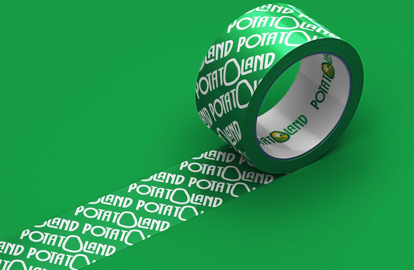
Through a series of creative discussions and iterations, we developed a fresh and wholesome brand identity for Potatoland, focusing on conveying quality and reliability. Our work spanned logo design, packaging, and various forms of signage. The clean and striking green colour palette, combined with a bold and memorable logo, sets Potatoland apart in the frozen food aisle.

Brand Transformation
Presence and Family Values:
We aimed to create a brand with a strong presence that conveys trust, tradition, and quality, appealing to families and businesses alike.
Rural Roots and Community:
With most production facilities located in rural areas, the branding highlights Potatoland’s connection to local communities, resonating with consumers who value sustainability and locally sourced products.
Diverse Product Range:
The brand needed to communicate Potatoland’s wide variety of potato products, catering to both foodservice and retail sectors.

Design Elements:
We explored various font options, deciding to merge “Potato” and “Land” into a single unified word. The “O” in “Potato” was crafted to resemble a potato, making it immediately recognisable. We also refined the farmhouse illustration multiple times to achieve the desired rural, fresh appeal.
Packaging Design
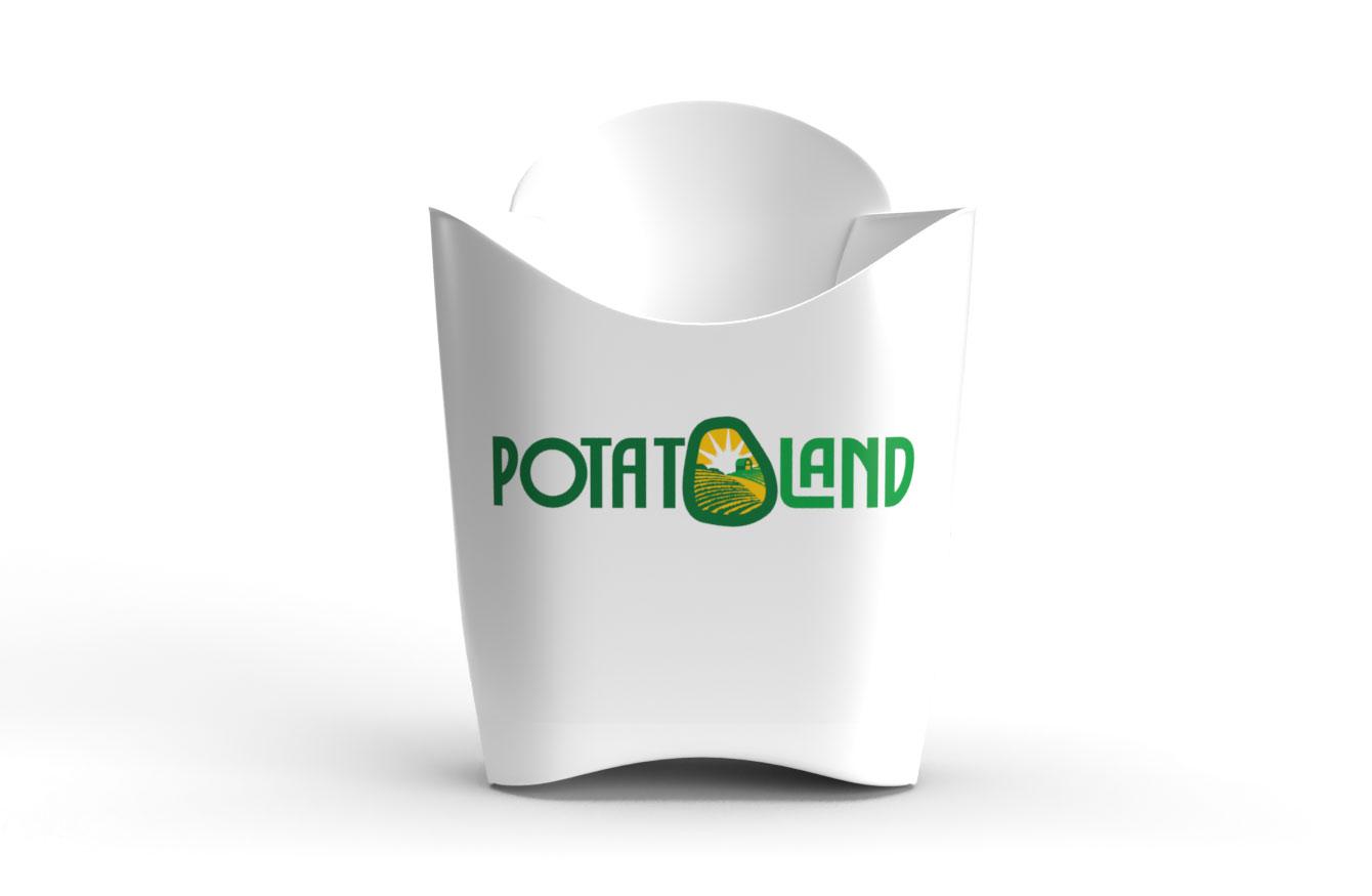
The packaging was designed to stand out in the freezer aisle, with bright greens that immediately evoke freshness and natural ingredients. The design system was flexible enough to be adapted for different product lines like fries, wedges, and chips. By using consistent branding elements such as the logo and colour scheme across all product variations, we ensured that Potatoland’s identity remained strong and unified across all consumer touchpoints.
Design System / Reusability
We developed a complete design system that included brand guidelines, typography, colour palette, and various packaging templates. This system not only provided consistency across all marketing and packaging materials but also made it easier for the internal team to apply the brand identity to new products as they expanded their range.
Results/Data
Results:
Though we’re still awaiting market performance data post-launch, the rebrand has garnered positive feedback from stakeholders and industry partners. The cohesive design has helped Potatoland present itself as a credible competitor alongside major frozen potato brands. Packaging that stands out on retail shelves has already led to increased interest from several key distributors.