

A Modern Evolution for a Fine Dining Favourite, Created for Zoya Restaurant.
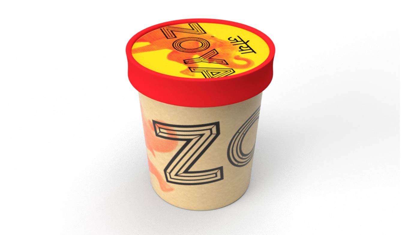
Refreshing the Identity of a High-End Brand, Subtly and Impactfully for Zoya Restaurant
Ltr10 Creative was entrusted with updating Zoya’s brand identity to align with their new focus on takeaway services, a pivot made during the Covid-19 pandemic. By adapting their traditional logo and enhancing their colour palette and design versatility, we created a brand identity that resonates with both their established dine-in clientele and new takeaway customers, without losing brand familiarity.
Client
Zoya Restaurant
Location
Leeds, West Yorkshire, with locations in Oulton and Morley
Overview
Zoya Restaurant, a leader in contemporary Indian cuisine, is known for blending classic Indian flavours with innovative techniques in a fine dining environment. With a diverse menu that caters to high-end dining, Zoya provides a luxurious and socially engaging atmosphere, offering an upscale experience that includes private dining and events. Their unique blend of Indian and British influences, as well as their modern approach to classic Indian dishes, makes Zoya a destination for refined culinary experiences.
Industry
Hospitality, Fine Dining
Scope
Branding, Branding, Packaging Design, Social Media Setup
Project Summary
Challenges:
The Covid-19 pandemic forced Zoya to pivot from an exclusively dine-in experience to a takeaway-focused operation. This shift revealed a need for branded packaging that would resonate with takeaway customers while staying true to the established Zoya brand. Their existing logo—a bold sans-serif font within a circular floral pattern and limited to an orange palette—lacked the depth and adaptability needed for a cohesive brand identity in this new context.

Our Solution:
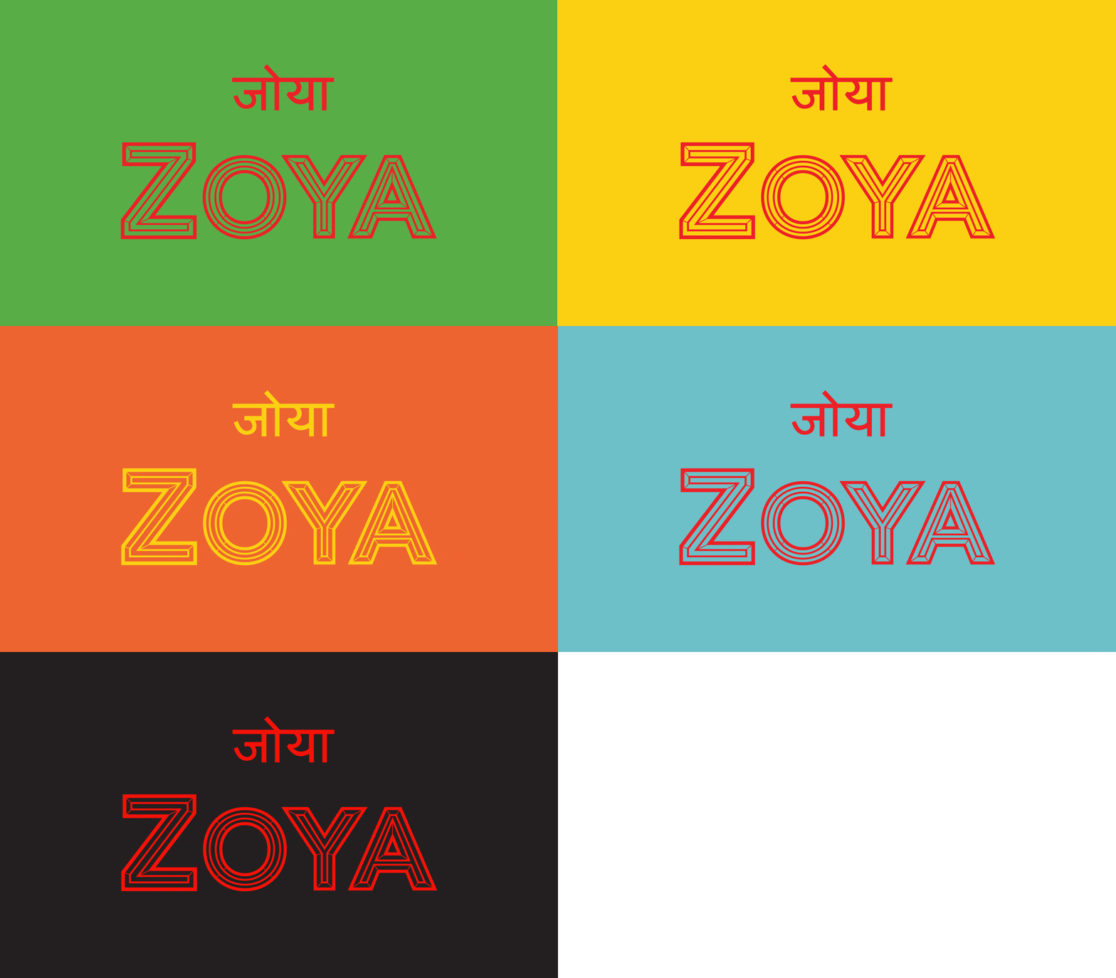
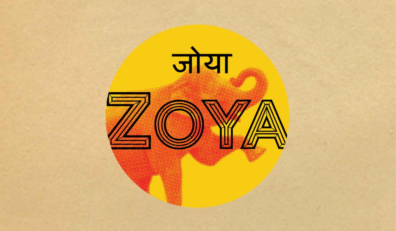
At Ltr10 Creative, we refreshed Zoya’s visual identity to meet these new demands. We re-created their floral logo pattern as a vector for scalability and integrated contrasting colours to add depth, while maintaining the signature orange for brand familiarity. Our redesigned logo added subtle dimension to the font, incorporating decorative strokes to enhance visual interest without straying too far from the original. This thoughtful update provided Zoya with a revitalised identity that both respects their heritage and supports their evolving business needs.
Brand Transformation
Refreshing an Established Brand Identity:
Zoya’s existing brand identity was limited by its simple orange colour scheme and JPEG-based floral pattern, which restricted adaptability across various media. Our goal was to add depth and versatility to their visual identity while preserving the iconic elements that loyal customers recognised. By transitioning the floral pattern from the main logo to a secondary brand element, we created a cleaner, modern logo that feels both fresh and familiar.
Key Considerations:
Tone & Aesthetic: The new design adds depth to Zoya’s identity while maintaining the elegance and sophistication that align with their fine dining atmosphere.
Audience Appeal: We retained Zoya’s recognisable orange colour while introducing complementary shades, ensuring the brand remained approachable to their high-end clientele even with a shift in service style.
Design Elements Refined:
We modernised Zoya’s typography, expanded their colour palette, and refined the floral pattern for versatile use in packaging, social media, and more. The subtle yet impactful changes allowed us to stay true to the brand’s original essence while enhancing its appeal.

Alignment with Client Values:
At Ltr10 Creative, we believe that a strong brand is felt as much as it is seen. For Zoya, this meant creating a visual identity that captures their commitment to quality and authenticity while evolving with their operational changes. The updated brand identity provides an experience that aligns with Zoya’s dedication to culinary innovation and customer satisfaction, forging an emotional connection that goes beyond aesthetics.
Website/Design Overhaul
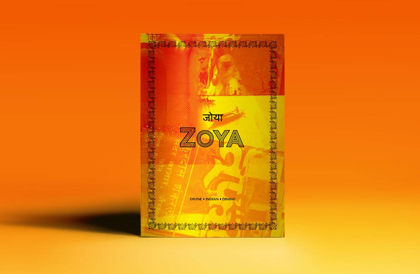
Although a website redesign was outside the project scope, we offered visual mock-ups and design suggestions for Zoya’s website to align with the refreshed brand identity. These suggestions focused on enhancing user experience and reflecting the new visual elements we developed.

Creating a Scalable Design System:
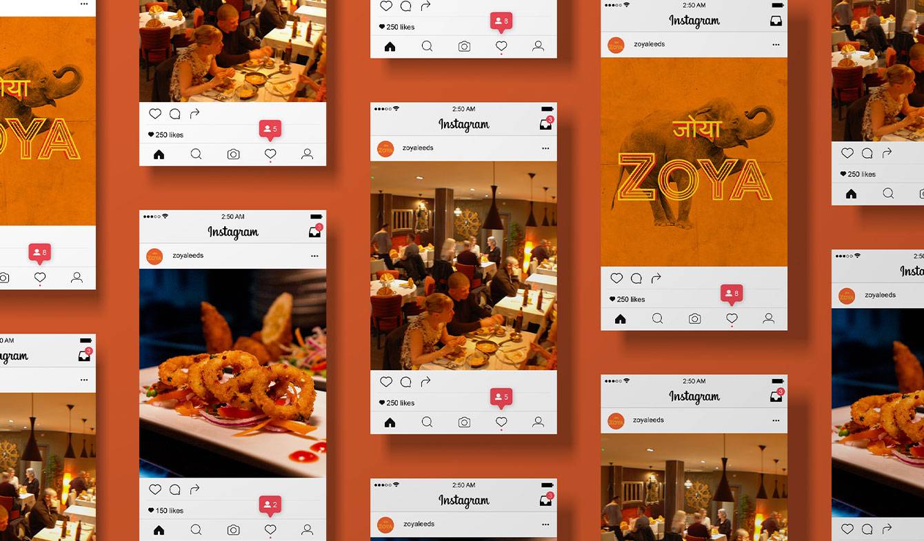
We developed a comprehensive design system that includes typography, a refreshed colour palette, and reusable templates for social media and packaging. This system enables Zoya to maintain brand consistency across their materials and makes it easier to introduce new design elements as their business evolves.
Results
Zoya’s rebranding has received positive feedback from both customers and stakeholders, reflecting the brand’s refreshed identity and adaptability in a competitive market. The new brand elements have strengthened Zoya’s takeaway presence, making their packaging instantly recognisable and memorable.